This week's sewing is greatly satisfying, as I have used a pattern I have been wanting to try for the last 4 years, but could not get my hands on.

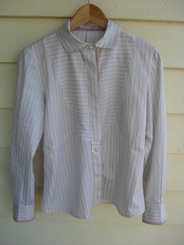
My version of this very popular blouse,
BWOF 01-2208-107/8 is due to
Carol, who kindly loaned me her copy of the magazine, from which she has made some fabulous garments, both in 2008 and recently. I have kept her magazine far too long, having indulged in an unprecedented amount of tracing.
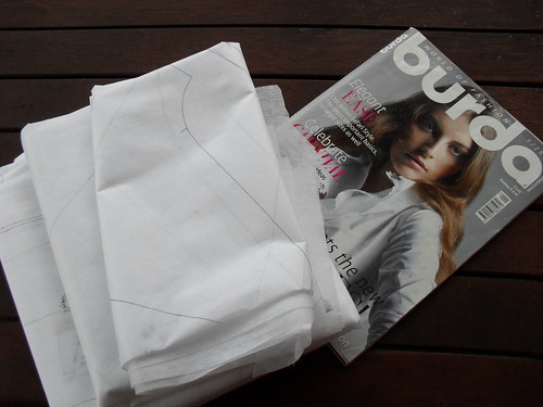
I admit it was with some reluctance that I posted it back to her, but be assured, Carol, despite any
inclinations indications to the contrary, I am not a pattern magazine abductress,and it is hopefully arriving back to you early this week. I am very grateful for your generosity.
I wanted to try this blouse, not just because of all the gorgeous versions about (mostly the short sleeved version)
, but because I wanted to try the full bust adjustment, this being a bit of a new adventure for me in a bib front blouse of this shape.
I mostly used
Debbie Cook's excellent tips and drawings, from her version of this blouse.
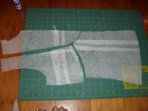
My interpretation of her instructions lead to the above additions to the front pieces. (My other fitting alterations were a square shoulder adjustment, shortening of the sleeves, a full biceps adjustment and a little waist nipping)
I was quite pleased with the fit of the bodice - a little less fitted than the magazine intended I suspect, but this is not a bad thing for me in a work blouse.
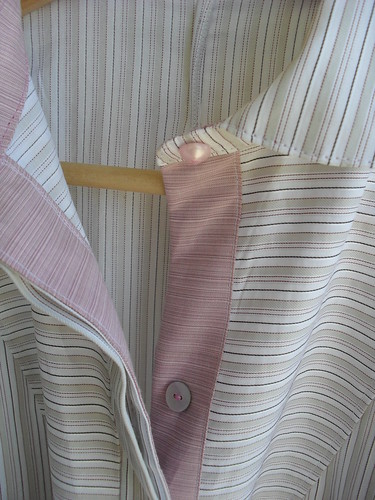
My next issue was with the front placket. In the magazine, the top section of the blouse is buttoned in the usual manner, with the bottom section having a concealed placket.
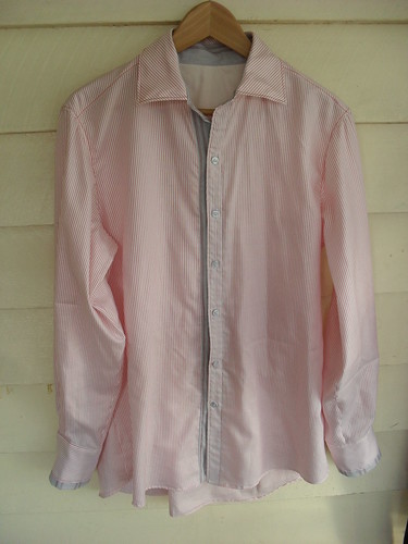
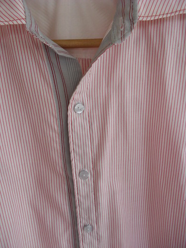
I wanted to use a contrast fabric for the inside of the right, overlapping placket, and the whole of the underneath placket. I also wanted the plackets to use self fabric for interfacing, in the manner of David Page Coffin's
Shirtmaking instructions. Fiddling with this rather late one evening, I decided that the lower section of the overlapping placket required an additional step, and could not understand why there were so many layers of fabric in the top section.
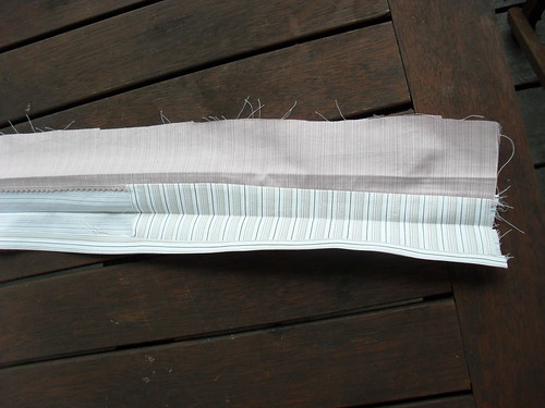
When I reviewed the placket the next morning I realised that Burda applies an extra section to the lower part of the placket. This was too late for me, as I had already applied this same section to the upper half of the blouse, admiring my own cleverness as I prettily enclosed the seam of the tab in this section rather than having to fold over 4 layers of fabric as suggested by Burda.
I moved on, feeling only moderately stupid, and came up against a stripe direction issue in the standing collar.
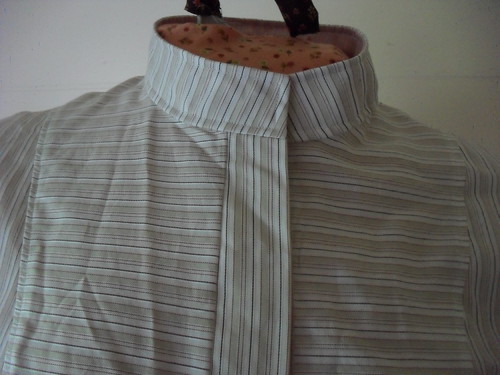
I should have cut the stand with the stripes going lengthwise.
Try as I might, I could not imagine myself actually wearing this blouse with the leaning stripes so prominently displayed. Naturally I had been convincing myself throughout the hand stitching of the inner collar and the topstitching that no-one would notice, but I had to admit that this was a lie once the thing was finished.
I chopped off the top seam, unpicked the topstitching and turned this standing collar into a collar stand for the collar from version 107, via some tricky handstitching to convince the collar stand curves to behave. I am pleased with the collar, and can live with the wonky stripes on the stand now than there is a collar to distract the eye from this detail.
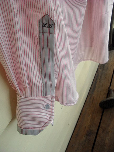
Next were the cuffs and plackets. I did not want to use a bias strip for the placket, so used the David Page Coffin
Shirtmaking instructions for a regular placket. I scaled down the placket piece from the pattern I use for my husband's shirts.
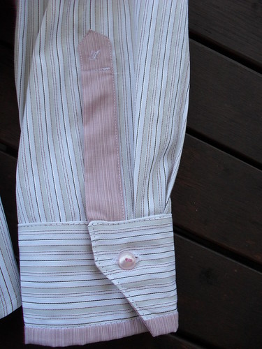
At this point I also came across this
interesting post by Pamela Erny, where she describes how to wrap the cuff so that the inner cuff contrast fabric appears at the outside. I combined her instructions with the David Page Coffin instructions and my own intention to have a diagonal slant to one end of the cuff and only had to unpick and recut the inner cuff once ;).

I can wear the blouse buttoned to the neck, but prefer it with the collar open to show the contrast.
This was an interesting and rather challenging project for me, mostly due to my own errors, but I am sure my next version will be more straight forward.