I really dislike the isolated gathers below the bust. The magazine photograph looked horrid and unflattering IMO.

(Photographs from Burdastyle website)
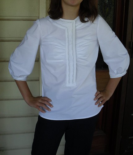
However, when my daughter and I were looking through the Burda magazines for SWAP ideas, she fancied the neck and placket on the line drawing. She asked, could I gather the whole front? She has good ideas. Normally, I make a small bust adjustment for her, gathering from above the bust instead worked nicely IMO, and was much less trouble.
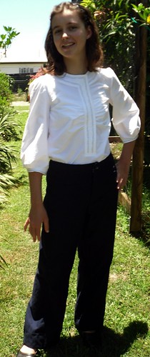
Here is the blouse worn loose, over the 12-2009 trousers I already showed you.

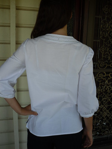
I have used machine embroidery (mode3, #68 on Janome 6600) in pale grey thread on the neckline and placket. I have also tried to make the fastening snaps invisible from the right side, rather than use them as a decorative element as shown in the magazine.
I also used machine embroidery on the cuffs. Neither of us liked the ties in the magazine, so the cuff is just sewn in the round.

I like the blouse best worn tucked in.

Materials Cost:
White cotton shirting fabric, about 160cm wide I bought the end of a roll at a closing down sale for about $6 per meter. Call it $7
Pattern - the first use of this magazine, so $10.55
Thread, one roll of white, one roll of grey, $6
4 snaps, at $1 for 20 pairs, and a smidgeon of interfacing
Total, approximately $24.
17 comments:
Funny thing personal taste. I'm making this blouse at the moment and have absolutely loved the design since I saw it. But I have been debating about the whether to include the ties on the arms or not. Your daughter looks lovely in hers.
Very nice. I completely ignored this in the mag, but love yours. I like the gathers moved to the bust, and being not all that busty myself could see it being a good thing.
Beautiful and IMO much better than the weird burda version. Nice work!
Nice shirt. Your daughter has a good eye for design. She looks good in her shirt
Yours looks much better than the original. Moving the gathers makes a huge difference.
Really cute, raising the gathers made this into Perfect for her.
Good call on moving the gathers up. When I see a blouse with the details below the bust, my first impulse is to move them up to the bust. It just looks like the top doesn't fit right otherwise.
Love it!
I didn't like the picture either, but it changes everything with the gathers up higher. Plus, I think the cotton works better than a slinky fabric.
Fabulous! I too thought the blouse was serious ugliness - especially in the photo. I would have completely overlooked it, but now I might give it a second glance.
I like your version best - very nice
How very pretty!!
I was really intrigued by this issue: they used an older woman with what looked to me like a waist that had seen childbirth. I really applauded them for that - what's more they used her for 2 shoots - which meant she had a high profile in the magazine.
But there's no doubt - some of the clothes don't look that flattering on her and - gasp - don't even fit that well.
Since that experiment I've noticed they're back to young, svelte beauties and each theme has a different model, so clearly it was not a big hit. That's a shame. But maybe we all like a little fantasy in our lives?
I think you and your daughter have improved this design immeasurably. I thought the original design had possibilities, but somehow didn't quite work, too much "low" - low gathers, low sleeve detail. It looks more balanced now and the eye moves more restfully.
I hope she loves that blouse because it is as cute as can be on her!
That's a very sweet top - love the embroidery - great modifications.
Lovely save on that pattern! I had shuddered and dismissed it when I first saw it. But yours turned out beautiful.
I absolutely agree with your opinion on the blouse as it is in the magazine - terribly unflattering gathers. But I like the rest of the blouse, and I love how yours turned out, so I'll file away your tip on gathering from the top for the future!
Post a Comment